Maybe you were expecting a long wait, given yesterday's post? I've been mulling over the best of the September photos pretty well since I got back from Yukon, liking all of them. And then the film images came back from the lab and my goodness!
But once I sat down and looked at all of them with an eye to picking out the best of the best of the best (quoting agent J from Men in Black) it winnowed down fairly quickly. Even so, I might make different choices if I were to look at them in a month, and who knows how things will turn out for Image of the Year? Maybe printing these and others will change my perception.
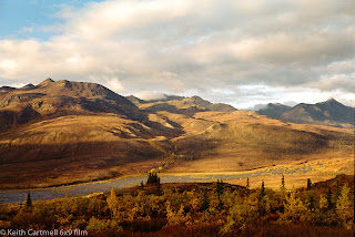
Picking these does not mean I don't like the others. We're getting into fine points of preference here, and I completely expect readers might choose differently. The images are quite different from one another in terms of mood, so someone who likes colour and contrast and reflections might choose the beaver pond. Someone into panoramas might choose that one. And someone who likes an image that looks a bit like a painting might like the the mountain side with all the shadows.
One of the images is ever so slightly different than what was in an earlier blog. I made another pass through looking for dust spots, and tweaked a tiny bit of the image.
Once I started capturing images on film, I had wondered how long it would be until one became Image of the Month. That turned out to be quite quickly, with March, April, and May selecting film. Now for the first time, all the images in the running are film. Even when there are comparable photos, I am loving how the film looks. For the record, all are Kodak Gold 200, using a Fujica GW690, and all are lightly edited in Negative Lab Pro and Lightroom. The beaver pond had the least editing; it really was that bright and clear.
So I'm down to 3, and the real struggle is trying to decide which order to place them.
Second Runner Up
First Runner Up
Image of the Month
In the end I landed on this because I love reflection photos, the clarity, the detail, the first letter of my name is in it because I composed it that way, the colour, all that with very little editing. This is how it actually looked.


From Sean.
ReplyDelete"
Hi Keith,
Blogger and my computer are having a momentary spat so here is my comment on:
September Image of the Month
--
All fine choices.
The first runner-up is looking even better. It appears to glow more now.
Cheers, Sean
"
I nearly swooned when I saw that one emerge from Negative Lab Pro. Sean and I have extensively discussed how images look, and why some look like tacky photos, and some look like paintings. That runner up came THAT CLOSE to the winner, and will certainly be in the running for image of the year.