
1.

2.
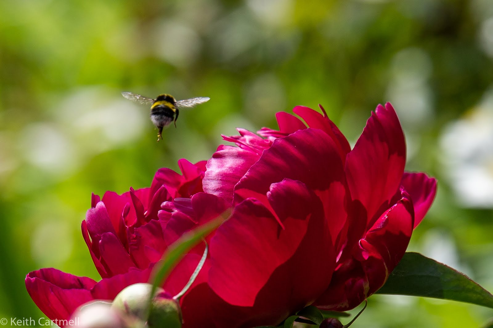
A bee checking out the peony! We haven't seen as many bees around as we'd like, and hope they're ok. Now, you might think, SIX photos of the same flower with the same bee. Isn't that a bit overkill? You might think that, but you'd be very wrong. Extremely very wrong. Catching a bee in flight, in focus, even seeing a bit of wing detail is extremely hard. Try it yourself. So if I get a good photo of a bee in flight, it's going on the blog. Even if there are 6 of them.

3.

4.

5.

6.

7.
8.
Similar timing and angle, trying to catch the sun making the petals glow. Stupid clouds.

9.

10.

11.

12.
From a little earlier, before it unfolded.

13.

14.
The on purpose plus. One of the secrets to making some photos look better is to convert them to black and white. The blue-y distant mountain shots are a no brainer for that, at least now for me. Other shots where colour isn't important, or there isn't much colour, often look better in black and white.
And yet, here's the red peony in black and white even though it's a deep glorious red that is hard to photograph well. I'm still working on it. The water drops seem to show up better, and there are some faint magenta tones in the colour version I don't care for. See for yourself. These are identically processed, except for the conversion. I used Lightroom's conversion, not a fancy pants specialty software

15.

Of the Day
Michelle

Curtis
In his new supervisory role. Yes, I've taken another work contract. I was made an offer I couldn't resist. Short. Part time.

Just so you don't forget, there is a white peony, and you'll be seeing more from it.

Driftwood

Ribbon Creek

Me

We of course beelieve you - bees are difficult. Nicely done! In answer to the unspoken question which do you prefer B&W vs colour. You already know my answer but that is beside point. The colour catches my eye and I go ooo, but I spend more time with the black and white. The raindrops, their size, their placement, their magnifying quality, are all much more apparent and interesting in the black and white version. Cheers, Sean
ReplyDelete