No, I'm not talking about the famous 1977 Cheap Trick album that was one of my favourites. Still is, actually. I'm listening to it as I write.
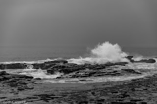
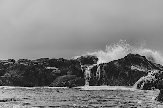
I'm thinking about photos that work better in black and white, rather than colour. I recently blogged two photos of waves crashing over rocks. They were in colour, just barely, and Sean suggested they might look better in black and white. I hadn't thought of that at the time and after a few minutes of processing, I had black and white versions of them.
What do you think?
And.
There was a bit of additional processing for the B&W version, and I'm still not 100% convinced I got it right. I could probably make the water whiter. There is specialty image editing software specifically for B&W, and I'm considering getting it, and seeing what difference that makes.
The two most recent rolls of film, which are currently at the lab, are B&W. I'm pretty sure I know what the 120 film photos will look like, but being long exposure, you never know till you see them. The 35mm has been in the camera a while, and I no longer remember what started the roll. That's part of the charm of film. Part of the trick to editing is to have some time between making the photo, and seeing it. I'm having fun reviewing old photos to decide what to add to VERO for my daily update, but sometimes I look at a photo and wonder why I edited that, or thought it was good at the time.
Of the Day
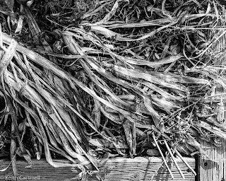
I'm also reading a book about B&W photography, and after seeing one of the examples in the book, I was inspired to go out and capture something I'd seen the other day. In colour they are yellow and white and kind of gross looking actually. Converting to B&W, and tweaking the sliders a bit more than would be seemly for colour, you get this. Artistic? Or still gross?
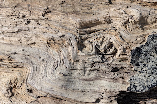
Driftwood (NZ)
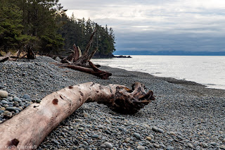
Driftwood (BC)
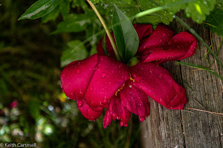
Peony
Tombstone
Film (new) In fact, I'm out of new film photos at the moment, though I've got a roll of both 35mm and 120 at the lab right now. So to hold you over, you get another old film photo. This one is a rare occurrence, to see all of Linda's brother's and sisters together with their mom. From L to R, ignoring the small children, Kelly, Angie, Dave, Mary, Linda, Audrey, Gerald, and Kim. The time frame is 1992 or 93, as near as we can tell. Sad to say, but three of those people have passed away.






I've had a couple emails from regular readers, commenting on the 4 photos, and their thoughts of the comparison between them. One mentioned the B&W seemed more real and the colour more artistic, and the other liked the starkness of the B&W, but also the mood in the colour. Thanks so much for comments, and keep those cards and letters coming!
ReplyDeleteYou already know my vote, but for the record, I prefer the B&W. Getting this "field" images right is difficult. There is also a purity about them in that there is only line and light (and by extension tone). The bones of 6 are good, I might try darkening the hot spot on the far left, judiciously brightening parts of the centre , and then adding a hint of vignetting to keep the eye in the frame.
ReplyDelete