I'm having fun thinking about images with the really wide lens, compared to really long.
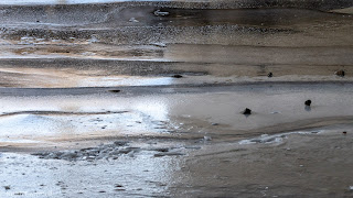
Starting with long today, even though this is really a continuation from yesterday's blog. Here's a companion image to one from yesterday. It's not quite as serene, but there's more texture in the ice.
Another view of bridge 8, and one of the views from the bridge.
What's making the murals even more interesting is that my buddy Sean has posted some of his photos on his blog. For the first three below, I'm thinking his edits are a bit more accurate in matching the actual colours. Mine are a bit more vivid, shifted a bit from green to blue, and I brought up the contrast in the bricks.
The artist is Adam Zhu, BUMP website, personal website. What complicates this one is there is a parking lot vending machine right in the middle. The BUMP website shows one solution to that problem.
This is another where the light was difficult, with a strong divide between the brightly lighted left and shadowed right side. It's obvious where the divide is in mine, and completely not obvious in his. There are tools in Lightroom to fix this, but I decided to go towards the lighting I saw at the time.
The artist is Katie Green, BUMP website, personal website. Note, her personal website is totally NSFW.
Did I mention that it's time for AMA? I've already started to think up questions to be attributed to non -contributers.
Yes, I know which is going to be December Image of the Month, but I've still got two days where I might get an even better photo. You never know...
Yes, I'm working on 2018 Image of the Year.


Wow! Love the murals. And the first and third photos really appealed - especially the light on the bridge. Can we maybe chat about photography stuff by skype when I retire?
ReplyDelete