This post might be mainly of interest to photographers and other visual artists, or people interested in such things. Never fear, scroll down a bit and you'll come to the Of the Day section.
One of my readers commented about the barn in this post leaping off the page for him, which is what it does for me too. I quite like the shot, and it would be one I'd consider printing to go in a gallery, if I did such a thing. It's one of the photos that are both well done (IMHO) and would appeal to a wide audience.
His comment made me go back and look at the raw photos from that site. I couldn't remember off hand if there were any more of the barn. (Short answer, no.) That barn was a walk around to find my desired composition. I'd already nailed the camera settings from previous photos, so it was focus and shoot. Then get back in the van.
What I spent the most time on was a row of sheds that first appeared here. (You'll have to scroll down a ways.) I loved everything about the scene, and strolled around trying to find a composition I liked. This was not a case of look, see, shoot, done. There were actually almost 2 dozen shots, and going back to them I discovered that I'd shot several of them with the intent to build a panorama.
As a digression, in my own editing, building a panorama breaks my workflow of doing single images. I like to mark them and come back, but don't always do it, especially if there's a lot of other images to look at.
So to remind you, here's the original photo of the sheds. I've got a bunch taken from about the same place at somewhat different focal lengths.
And the assembled panorama in a 9x16 format, about 7080 px or 24 inches wide.
One of the things photographers often try to do is get a sense depth in their work. Our brains know that bigger things are often closer, things that are the same size in a row will appear smaller as they are further away, mountains are typically very large and far away, that there are implied lines that can lead us into the photo or around it. Composition is a way of using these and other conventions to build a more interesting photo.
Sometimes the position of the camera doesn't matter much. Other times, like the photo below, moving the camera even a cm or pointing it in a slightly different direction, changes the image dramatically. This was October 2020 image of the month, and first runner up for image of the year.
For me shooting the sheds, the position of the camera in terms of a few feet here or there didn't matter much. (A pro might be jumping up and down to disagree.) The focal length changed things more. But walk a few yards and the image changes. I'm still not convinced I got the absolutely perfect best spot to shoot from. If I'd had more time I'd set up a tripod in the perfect place and try some different shots, like a long exposure with an ND filter, HDR, different sizes of panoramas. I'm really pleased with my photos, but a pro landscape photographer would certainly have some suggestions to improve what I've done.
So as soon as I looked at the assembled panorama, I see more foreground grass and a bit more sky. I started thinking about the best way to crop it to better place the sheds in the landscape. But something nagged at me. Our eyes typically look at the top left of an image first. After all, we read from left to right, top to bottom. Having a photo lead your eye from left to right (at least initially) is a natural thing. The original image starts on the right, and maybe you'll get there by following the grass from the bottom left.
As a trial I swapped the image left to right, and instantly liked it better. The close shed is on the left, it's bigger, and the line leads to the truck at the end of the sheds. You did notice the red truck at the end of the sheds, didn't you? There's a white spot in the clouds right near the top in the panorama that's not there in the original, that helps give a sense of depth. The panorama gives the sheds a bit of room from side to side to open up the image, but not so much they get lost in the landscape. There's also a few more lines in the clouds in the panorama.
I didn't try to replicate the original edit settings, but they ended up similar, which is not a surprise. The original had just global edits, but I spent some time tweaking the panorama sky, since it was a big part of the image. Nothing too dramatic, though I certainly could have made this look like a Mordor sky.
A perfectionist might pick each shed and tweak the light on the sides to bring up the shadows a bit. I like it a bit dark, since the image is a bit dark, it being a cloudy day and all. The mountains in the background are a bit dull and shadowed, and for me, that suits the image. Another photographer might choose to brighten that up.
This is all a short term example of why I don't throw images away. Disc space is cheap. Sometimes it's good to go back to old images (like Aug 21, haha) and rework them, or have another look at ones you passed over. There's been several times I looked back and wondered why I edited this photo rather than that one.
It's also an illustration that all photos are a lie. Nobody will ever see that panorama image in real life. It doesn't exist. But if you went there you'd see the sheds and the mountains, and the field, though it might be a different crop, or there could be farm equipment parked in an aesthetically displeasing place, and who knows what the sky and light would be like?
So, photographers or visual artists. Am I full of it, or what? What would you do with that scene?
Of the Day
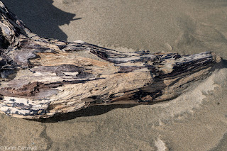
Driftwood
Flower
Peony
Lily
Dragonfly
Eagle
Owl. Yes, there really is an owl in that ball of feathers.
Random trip photos will probably be a thing for a while.


For the original 5 shed image picture, imagine if you will, an "S" that begins in the clouds and has the top bend near the truck. The middle diagonal follows the the greenery and sheds forward with the bottom bend at the front shed, and then moving back towards the bottom left. On this visual path the whole image is travelled. To my eye a little bit of dodging and burning could help the viewer see this "S" better. That proposed edit, to my eye, is more interesting than the horizontal flip, as the "S" curve gets lost in the flip, and a curve invites more exploration than a line. Unless of course, a line is what you would like your viewer to experience. For the record, my sales history certainly says I'm not a professional, and you asked :) Cheers, Sean
ReplyDelete