Believe it or not, I'm still looking through my New Zealand photos. I'm taking another look at the ones I like the most to see if I can tweak them a bit more and make them even better. Most of my photo editing is done using global edits, where a change affects the entire photo.
There are of course more subtle tools, where you can select a portion of the photo and tweak just that. Or, go beyond tweaks and torque the snot out of it. Creating the Mordor skies and virulent grass is easy. It all depends on what you want as a visual artist.
I generally tend to go towards a natural look. I like my grass to look like grass. We all know what grass naturally looks like. A golf course might be quite green, our lawns will be a different green, a mowed park will be a slightly different green, and a field of long grass is something else entirely. We know a sky can be a pale robin's egg blue, or winter dark blue in contrast with snow. Not to remind you of winter, but snow can be all kinds of different colours, with the shadows often tending towards blue.
None the less, we've got a pretty good grip on what the world looks like. If you edit your photo so that it doesn't look like that, you ought to have a good reason, and it better not be to cover up flaws in your camera technique.
So this photo. I'd aimed to have Linda along one of the thirds lines, and got pretty close. A tiny bit of cropping has her on the line, with her feet at the bottom third crossing. It had just finished raining and there was more rain coming, so the sky was a pretty uniform grey. I played with that a bit, trying to bring out a bit of contrast, but not so much that it looked fake. I can see some texturing my version, but I'm not sure how much will show up in your version. It isn't what you'd call a dramatic sky, but it sets a mood that I like.
The mist in front of the headland adds to that. I could have removed that, but didn't. It gives a bit of mystery and layering to the photo, and softens the faces in the rock. I was loving the texture of the wet sand with the fading footprints leading to the sinuous water edge, and the streaked reflection of the headland. It's clear there's a wind blowing, and Linda is damp, but not bedraggled. She is centered in the headland reflection, with her head right on the horizon line. The horizon line can be really important, but here I ended up with it right in the middle almost by accident. I wasn't looking at that during composition; more looking at Linda in relation to the reflections. Of course I had to level the horizon, I rarely nail that, even using the guides in my viewfinder.
This is one of the 5 star photos from the trip.
PS, this is Piha beach, off towards the north end, away from the surfers.
Driftwood of the Day
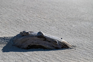
Part of the problem with beaches during the daytime is that the light can be really harsh. I shoot as found, and don't bring along anything to soften the light or cast reflected light. So this chunk of driftwood had me thinking. The first shot is the closest to what it looked like naturally. You can see the harsh shadow and the texture of the sand.
The second one is actually a different shot, not a cropping and re-editing of the first. I'm doing two different things there, so I deliberately took several different shots and edited them differently. On that first one I could have selected the dark area and brightened it, but I think it would have looked fake. We would know there's a shadow there, and expect it to be dark.


Yes, details matter and it shows in the picture of Linda. Either by luck or planning, the day pack also matters. It not only helps with a story, it also provides colour in the reflection. Nice portrait! Cheers, Sean
ReplyDelete