The Driftwood of the Day feature is now well under way, and there's been some nice comments, thank you.
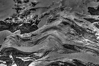
Today's blog is designed to generate comments. Same image, 4 treatments of a piece of driftwood on Paekakariki or Paraparaumu beach.
Some of you may have seen this one before. It was the first edit, done in haste on a laptop with a filthy screen. I used Photomatix to push the colours a bit. As I look at it now, I think I pushed them a bit too far.
Same image, straight out of Lightroom with what I'd call my normal edit.
Since I was looking at this, and since I'd recently been talking to a buddy that does lots of B&W, (Hi Lynda!) I dropped it into Photomatix again to try B&W. I don't have a lot of experience doing this, and maybe my eye isn't tuned to the subtle shades. I'm mostly liking most of the photo, but the top left portion of this one is just killing me. There's a spot off to the right that I thought would be dark shadow, but Photomatix brightened it up. The ones where Photomatix left the shadows dark, left them really dark. Maybe if I'd played with it more...
Since I was at it, and it doesn't take long, here's the B&W image as processed by Lightroom, exactly the same as image 2, but converted to B&W however Lightroom does it. This looks considerably nicer and more natural to my eye, especially the shadows.
This is the fun of Lightroom, working and changing the look of your images depending what your artistic eye is telling you. For the photographers out there, these were shot at ISO 200, f8.0, and 1/2500 s in brilliant noonish sunshine.
So, how would I rank them? Image 2 (the natural Lightroom colour edit) a nose ahead of #4 (the natural Lightroom B&W edit), mainly because I'm a colour guy not a B&W guy. The more I look at the Photomatix edits, the less I like them.
Your thoughts?


In the great tradition of 2 cents here are mine, to do with as you see fit. I know its not fair but 4 invites comparison to Weston, and so I agree with you that Number 2 is the best of the bunch. Personally I would like to see more shadow detail (this may have been lost in compression). That though then presents a problem as it would also increase the shadow detail in the background, and that background to my taste is already too pronounced. So a 5th possibility is to really muck around with this image and separate the photo into 2 layers. You could then desaturate the background leaving the foreground as is with a tweak to the shadow details. Phlearn has a good tutorial on how to use the pen tool in photoshop to isolate components of an image. Cheers, Sean
ReplyDelete