
That was a surprise. One of the experiences photographers live for (although there are far too many such to list here) is to see an image that was at least ok enough in real life to take the photo, and then discover it goes wow after editing. And remember, every photo you've ever seen has been edited. The trick is how much. It can be easy to over do it.
The second runner up is new to everyone, since I only took it last Sunday and haven't blogged since. The Image of the Month has been shared with photographer buddies on Facebook, so some of them might be seeing it again. I'm sure that just kills them.
And as an aside, I goofed in the title of last month's image, calling it November instead of October. My bad.
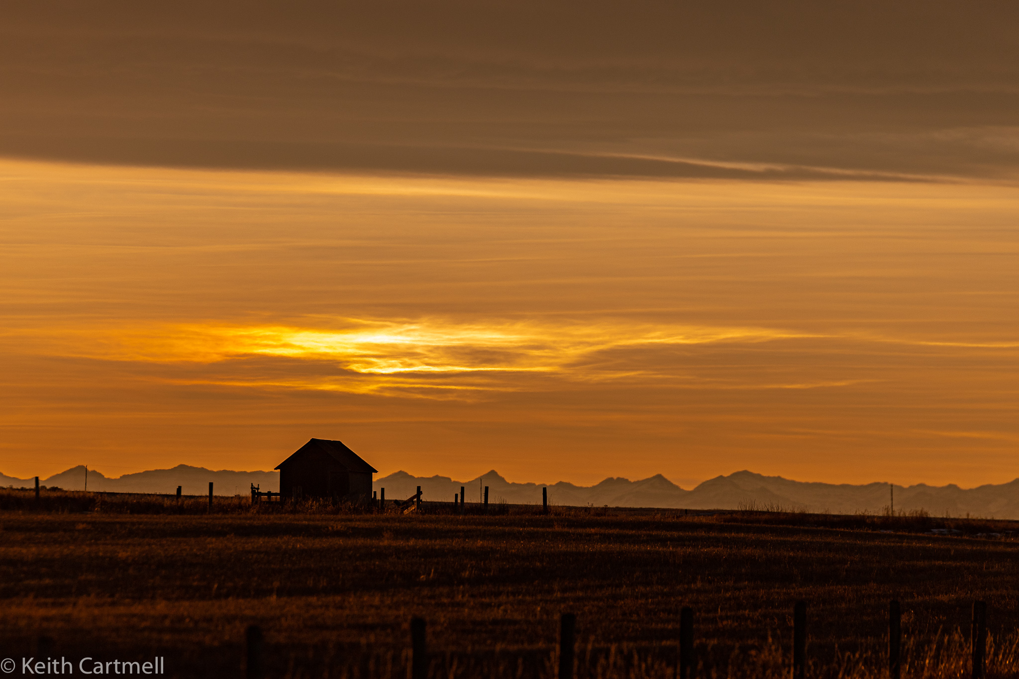
Second Runner Up
On the way home on Sunday afternoon the sunset was spectacular! I wasn't quite in the perfect place for it, but on the way there I saw this hut, and some sundogs just above it. Unfortunately, no matter what I did for editing, I couldn't get that bit of rainbow colour to show up in the image. There were several other 'Stop the van!' sights, but I was eager for the main show and pressed on. I'll blog some of the other sunset shots soon.
First Runner Up
This scene in Fish Creek is one of my favourites.

Image of the Month
This is in Wyndham-Carseland Provincial Park. I'd never been, and was itching to show my camera new territory. When I was looking at the scene, the light and reflections were really nice on the water, but what the camera showed me was pretty drab. None the less, I persisted. Then upon editing, wow!

All lovely shots but I think my favourite is the first actually. The second one is a lovely serene image but I would have cropped it a little differently to avoid cutting off the top of the trees in the centre. You pick for the month is truly lovely - maybe just a teeny weeny bit oversaturated for me - but different strokes for different folks, as they say. Speaking of saturation, wondering if my new laptop display needs to be tweaked to ensure my edits are what I think they are. When I look at images on my phone, I'm often surprised and dismayed by how they look - more saturated than I intended, with wonky colours. Could be my cheapish phone I guess. More investigation required. Have a good one!
ReplyDeleteThe image of the month is gorgeous Keith!!
ReplyDeleteI'm with Jan this month, and I think there are some things that could make it even stronger. 16 x 9 would remove the information top and bottom that doesn't add to the image and help emphasize the banding, and sense of space. The other possibility would be to add some light (horizontal gradient) to the bottom of the image to, keep the same ratio, and remove enough from the left edge so that the mountains are continuous. This would bring the foreground into the image (fence line gets echoed), have light in the sky gets echoed in the grass, and the shed would now be off the 1/3 mark. Cheers, Sean
ReplyDelete